Data Visualization in the Business World: Importance and Purpose
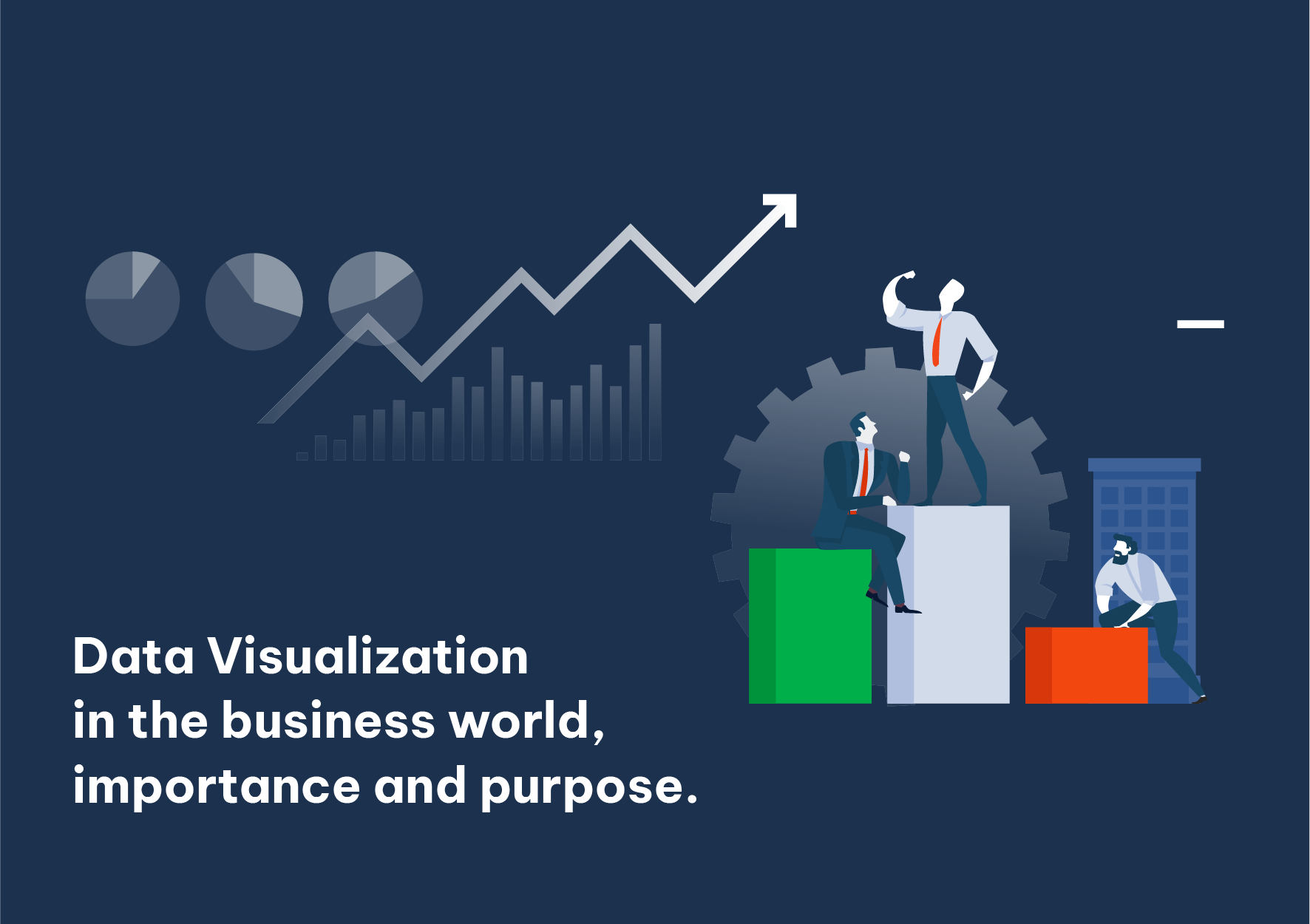
In today’s data-driven world, the ability to present information visually is no longer optional. Executives and teams are flooded with numbers; clear charts and dashboards help them see patterns, spot problems, and make decisions faster.
Good data visualization serves several purposes. It simplifies complexity: a well-designed chart can replace pages of tables. It supports storytelling: trends and comparisons become obvious. It also encourages engagement. People are more likely to explore and remember information when it is presented visually.
Choose the right chart for the job. Use line charts for trends over time, bar charts for comparisons, and pie or donut charts sparingly for parts of a whole. Avoid 3D effects and unnecessary decoration; they often reduce clarity.
Invest in tools and skills that let your team create and update visualizations easily. When data is visible and accessible, better decisions follow.